SilverCloud Health has surged through a period of rapid growth since our last redesign 2.5 years ago. For example, we have supported over 150,000 users to date, with 50% of those having joined in the past 12 months alone. In this time, the platform has broadened to support our expanding breadth of content and increased streams of traffic. However, after such sustained and organic growth we felt that the time had come to look again at the platform’s UI. By taking a gentle approach to refine the robust architecture and increase the sense of consistency across the platform and devices, we hoped to reinforce the user’s sense of security in the familiar and the reliable, while at the same time providing them with breathing space and the reassurance of calm in a more contemporary interface.
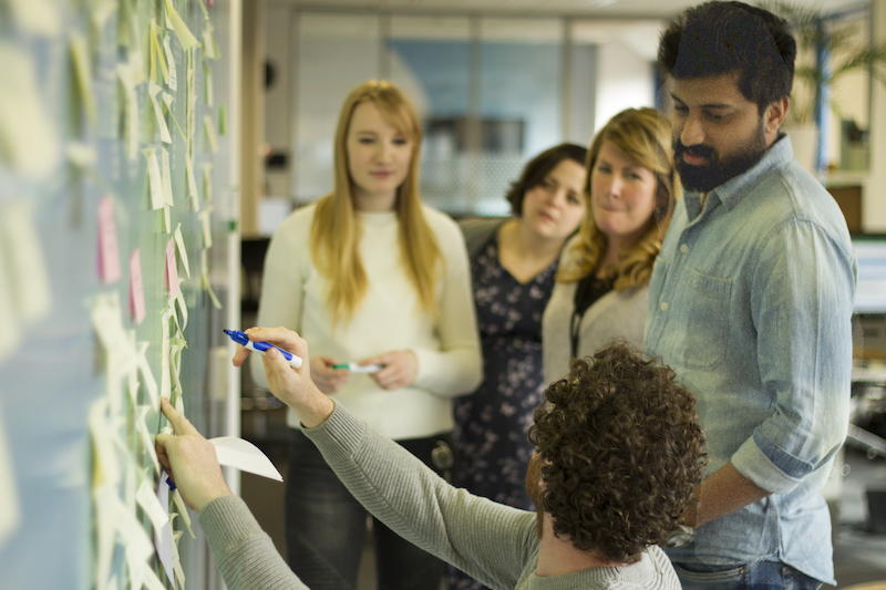
Whiteboards and Walkthroughs – The Process
Establishing a Sanctuary
We revisited our first principles in our initial approach to the redesign, reconnecting with why someone has come to the platform and how they may be feeling. This process foregrounded one of our foundational aims: “to provide a sanctuary to calm the mind”1, thereby creating a gentle and supportive space where the focus is on the user and their needs.
To further substantiate this concept of sanctuary we devoted time to assigning a platform personality2 to SilverCloud:
- defining the traits that underpin the brand;
- identifying both real and fictionalised characters who embody values associated with these traits;
- and determining an appropriate tone and voice for SilverCloud, ensuring that it echoes through every aspect of our communication.
This platform personality characterised the nature of our “rapport with the user”3 and provided us with the scaffolding from which to carry out the redesign.
The Foundations
From the outset, we were determined to take a truly ‘mobile-first’ approach, rather than simply extending a primarily desktop experience to mobile. By using the mobile design as the foundation, we were ensuring that the platform could flex to each user’s particular context, allowing them to start a task on one device and seamlessly pick it back up on another.
Accessibility was another principle that was embedded into the redesign from the very start. Every component was assessed through an accessible lens; from the size and specific grey hue of the font to the colour contrast of every visual element on the site.
Once the mobile, and subsequently desktop, versions of the homepage and content pages had been nailed down, we moved on to preparing for the transition from the old to the new. The pattern library became another foundational element in this process. Mapping it out at this initial stage, meant that all of the stylistic and functional specifications were defined from the start. Consequently, most of the heavy lifting had been done before the build had even begun. Having a single system of components and rules allowed the design and development teams to work both collaboratively and independently across the project.
The Threads of Collaboration
On an organisational level, SilverCloud is characterised by its steadfastly collaborative ethos. This extends from the democratic open plan office, to the interdisciplinary approach taken with every new project. These threads of collaboration were woven throughout the redesign process, with designers, developers, clinicians and members of the commercial team working in tandem.
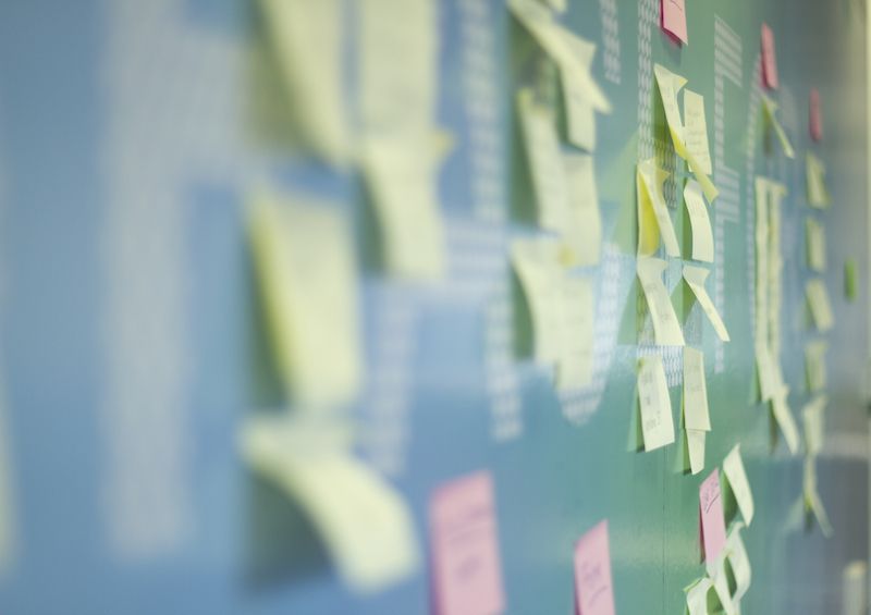
It was important to provide every member of the office with the opportunity to engage and participate in the project. We facilitated this by documenting the steps of the unfolding redesign in public and congregational areas around the office. The outputs of the preparatory research and the traits of the platform personality were recorded on the whiteboards bordering the working spaces of the design and development teams. Printed, annotated walkthroughs of the site were tacked along the main walkway connecting the two halves of the office. As the redesign progressed, we used prototyping tools such as Adobe XD and Invision to circulate mockups around the team, inviting feedback and contribution at crucial junctures of the project.
Soft but not Marshmallowy – The Outcome
Streamlining the Signposting
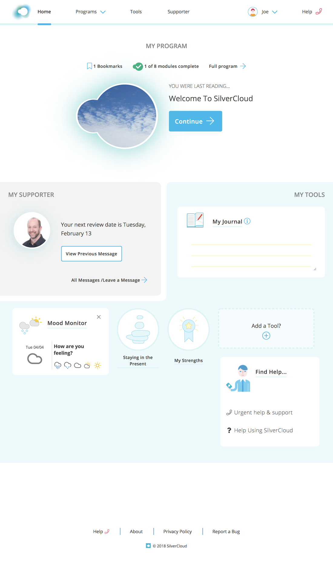
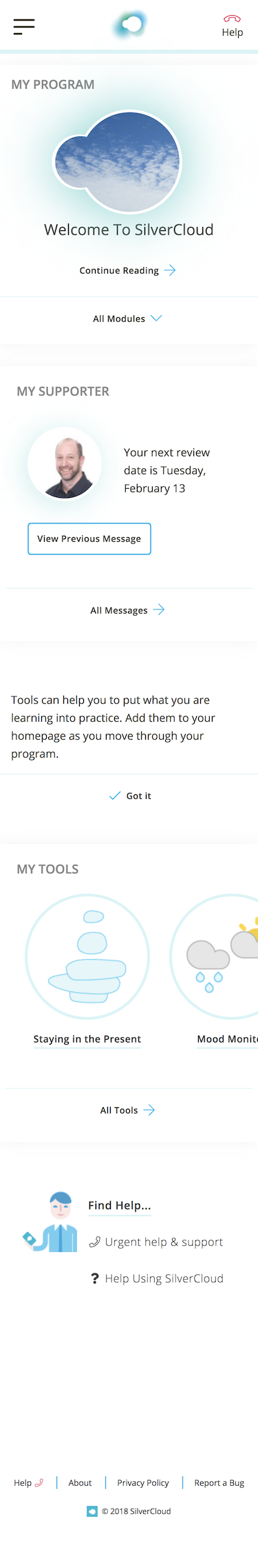
The Homepage
In the previous iteration of the platform, we had been facilitating the user’s journey from the homepage into the different platform areas by providing them with several pathways to each destination. Over time, feedback indicated that this range of options sometimes resulted in uncertainty as to which path to pursue. The redesign presented the opportunity to address this and to streamline the signposting on the platform, particularly from the homepage.
The result is a homepage clearly delineating the three core areas of the platform: the Programme, Supporter and Tools sections, highlighting a simple and intuitive path through each. In this restructuring of the homepage, there is a clear demarcation of hierarchy, with a single call to action heading the page and inviting the user back into the programme content. Although we have promoted a particular re-entry point, we are also encouraging exploration in the sections below, catering for the fact that users “find their own pathways when allowed.”4

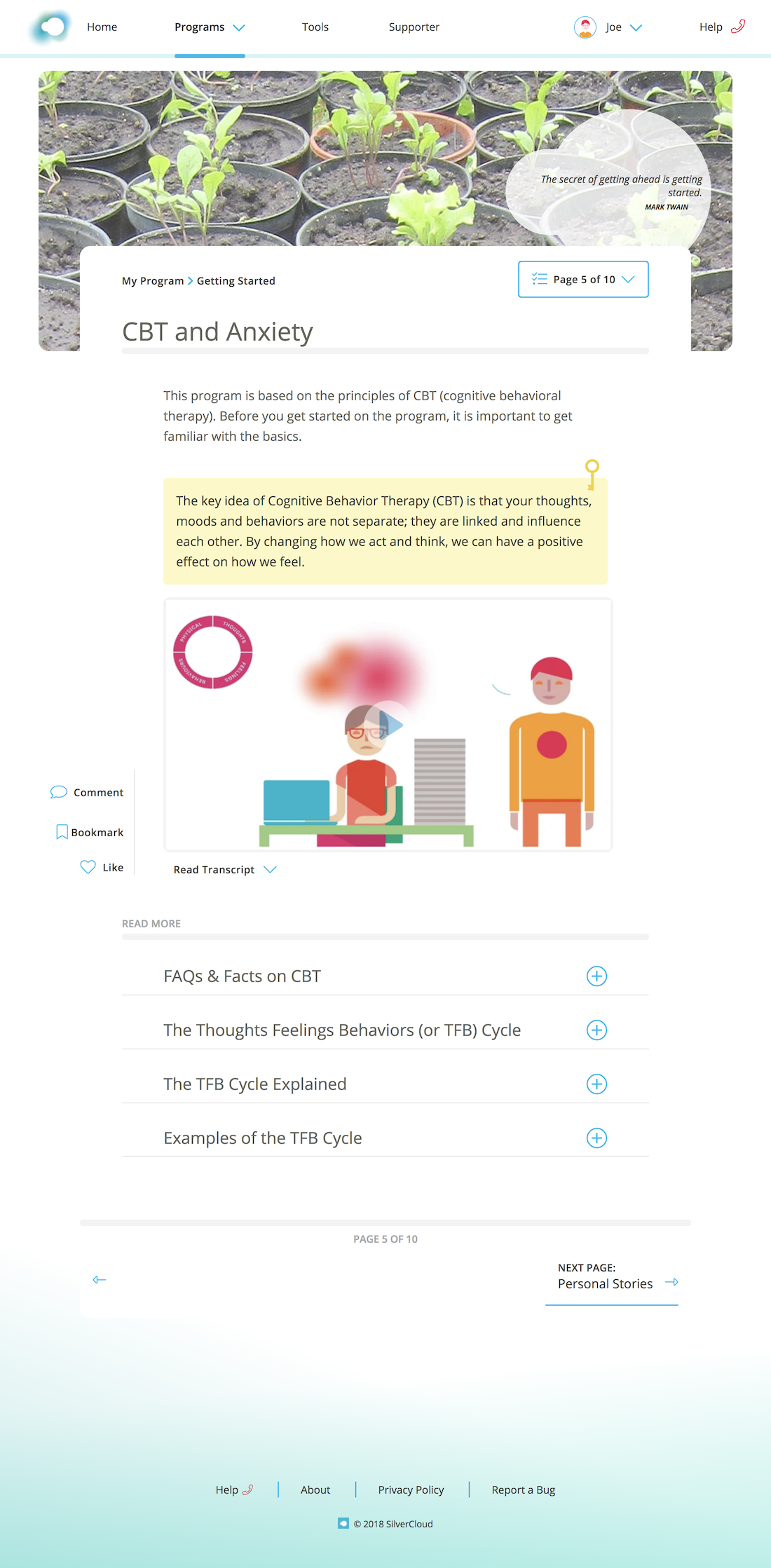
The Content
An analysis of the site metrics showed that the previous and next buttons at the footer of every content page were the primary means by which a user progressed through a programme. Less than 15% of people were using a left-hand menu bordering every content page, making it largely redundant. Abstracting this menu into a dropdown pattern allowed us to centre, and thereby foreground, the content. By minimising the “extraneous cognitive load”5 in this way, we were able to preserve the columns of white space on either side, providing the breathing space that is so crucial to the feeling of lightness and the concept of sanctuary.
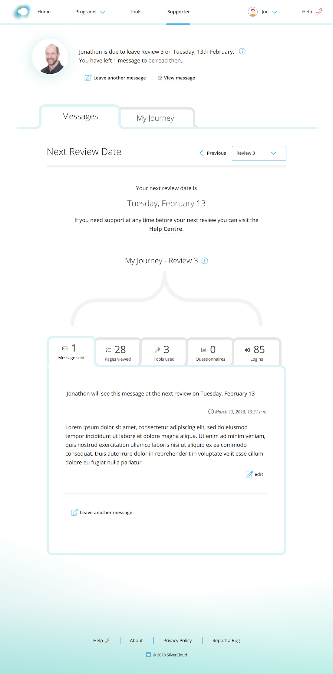
The Supporter Page and the Tools
Another new navigational element that we introduced was the tabular structure that can be seen primarily on the supporter and tools pages. This structure follows the principle of “progressive disclosure,”6 providing the user with initial simplicity, allowing them to then “control the pace”7 at which they uncover the content.
For someone who has a supporter reviewing their progress, the supporter page now has tabbed sections which catalogue and provide access to all of their interaction with their supporter. Alongside this, the My Journey section serves as a record of their achievements to date. The use of tabs means that the information can either be digested at a glance, with the tab headings giving a quick summary, or it can be investigated in detail, by cycling through the tabbed pages.
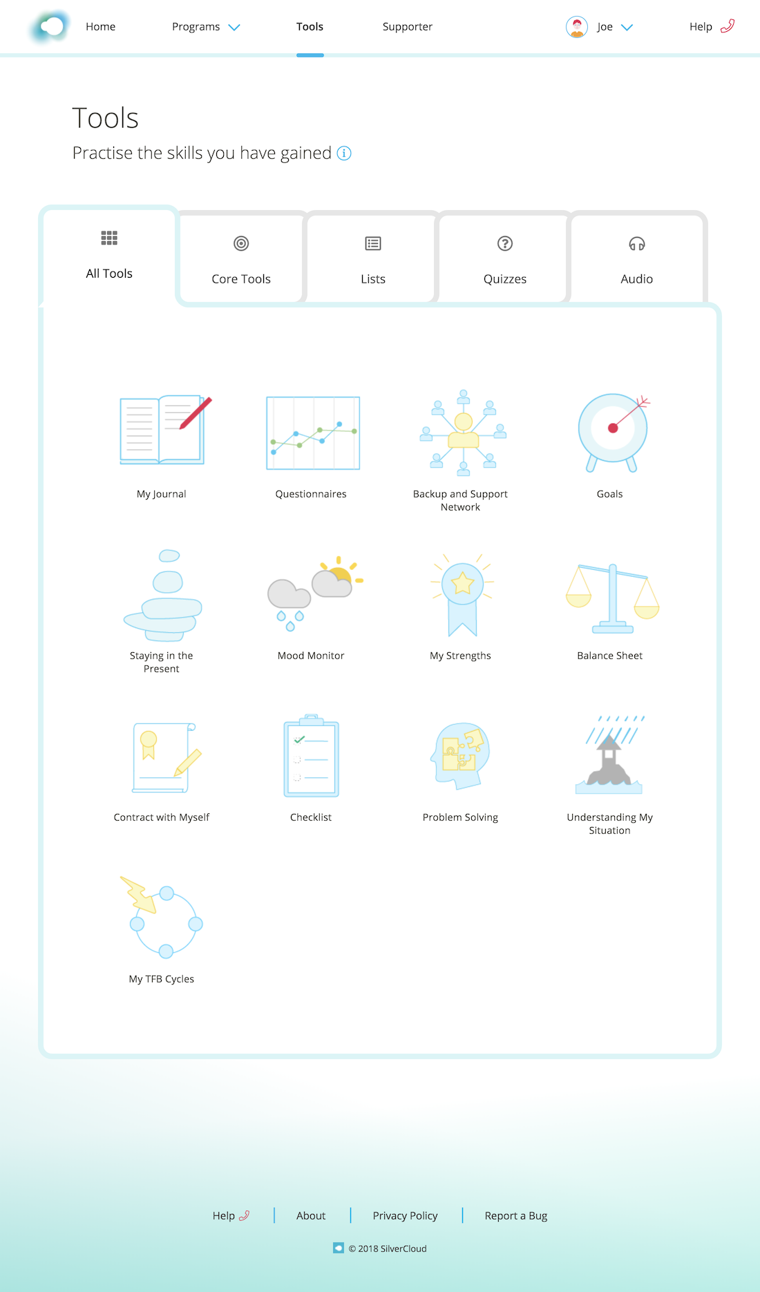
On the tools page, we have used the tabs to categorise all the various tools that the user acquires as they progress through a programme. These categories allow them to easily locate a tool that they wish to revisit, while at the same time giving them a sense of ownership over the portfolio of tools that they are collecting.
Softening the Edges
To better reflect the calm tone that we were aiming to achieve, we needed to soften the boxy containing elements and sharper edges of the site. The process of rounding the corners of components such as images, text boxes and buttons initially seemed relatively simple. However, in carrying out the exercise, we discovered that adjusting the radius of the corners by even a few degrees too many, ran the risk of over-softening these components, giving them an almost childish quality.
Somewhat jokingly, we then amended one of our overarching aims with the clarification that we wanted to make the platform soft but not marshmallowy. The phrase encapsulated the fact that we needed to bring a softness to the platform, without obscuring the robust architecture behind it. This tenet informed our treatment of even the smallest UI elements, so that any of the changes we made were carefully considered and thoroughly tested. The resulting subtle rounding of the edges runs congruent to the visual values of our brand, as the circular nature of the SilverCloud logo is now reflected throughout the site.
Updating the Visual Language
Colour
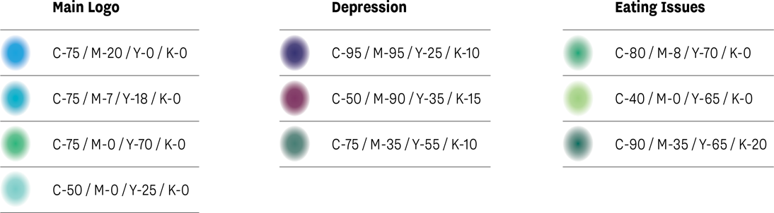

As part of the redesign we widened and warmed the range of colours used throughout the site, while ensuring that the selection made for each component was deliberate and measured. Our aim being that the new palette would work together to allow the user to make more focused choices, e.g. in the specifically action-oriented spectrum of blues, whilst staying within the remit of our branding.
Colour was also a means of adding vibrancy and depth to the site. A subtle gradient has been added to the footer, gently extending up the page. Previously flat, grey diagrams have been revised, with the addition of a warm ochre colour, functioning as a sort of soft spotlight on the primary focus of the image.
Font
For the redesigned site we selected Open Sans as the font to replace Arial. This new humanist font lends the content a lighter, friendlier tone, while the wide range of weights provides a capacity for greater expression.
Icons
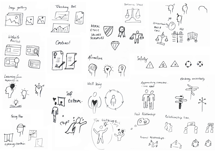
Throughout the site the icons have been refined to reflect a more modern aesthetic of pared back clean lines. This is particularly true in the creation of a new suite of icons for the platform tools. These icons function as immediate visual indicators of the nature and purpose of the tools, while their distinctive simplicity and limited colour palette distinguish the tool pages from the content.
Imagery
Each image used on the platform has been purposefully selected to contribute to the creation of a gentle and supportive space. The images serve as windows, adding colour, texture and context to the modules. The fact that they are primarily grounded in nature also resonates with the increasing legitimacy of the stress relieving and mood-enhancing effects of "green care" as therapy.8
Evolution
This latest project presented us with the opportunity to refine the aesthetics of almost every element of SilverCloud. However, the evolution of the platform is not solely confined to large-scale redesigns such as this. We continually invite feedback from each user, at several points throughout their journey, and we are regularly integrating the most up-to-date research and standards of best practice from both clinical and design disciplines. This feedback and research informs the ongoing iteration and improvement of SilverCloud to best meet the needs of our users, whether in the cross-platform refreshes or the more subtle updates that happen on a daily basis.
1Morrison, C. & Walker, G. ‘Final Report: A pilot study evaluating engagement with a platform supporting online interventions for common mental health problems: the SilverCloud study’ (June 2013)
2Walter, A. ‘Personality in Design’ A List Apart (October 2011) http://alistapart.com/article/personality-in-design
3Dickey-Kurdziolek, M. ‘Crafting a Design Persona’ A List Apart (June 2015) https://alistapart.com/article/crafting-a-design-persona
4Morisson, C. & Doherty, G. ‘Analyzing Engagement in a Web-Based Intervention Platform Through Visualizing Log-Data’ J Med Internet Res (November 2014) Vol 16 :e259 http://www.jmir.org/2014/11/e252/
5Whitenton, K. ‘Minimize Cognitive Load to Maximize Usability’ Nielsen Norman Group (December 2013) https://www.nngroup.com/articles/minimize-cognitive-load/
6Nielsen, J. ‘Progressive Disclosure’ Nielsen Norman Groupi> (December 2006) https://www.nngroup.com/articles/progressive-disclosure/
7Richards, D. et al ‘A randomized controlled trial of an internet-delivered treatment: Its potential as a low-intensity community intervention for adults with symptoms of depression’ Behaviour and Research Therapy (2015)
8Agnes E. Van den Berg, ‘From Green Space to Green Prescriptions: Challenges and Opportunities for Research and Practice’ in Front. Psychol., February 2017